National Aquarium
UX Design
Team:
Nicole De Venoge— UX Designer
Dan Rader— Creative Director
Maggie Chambers — UI Designer
Kickoff & Alignment
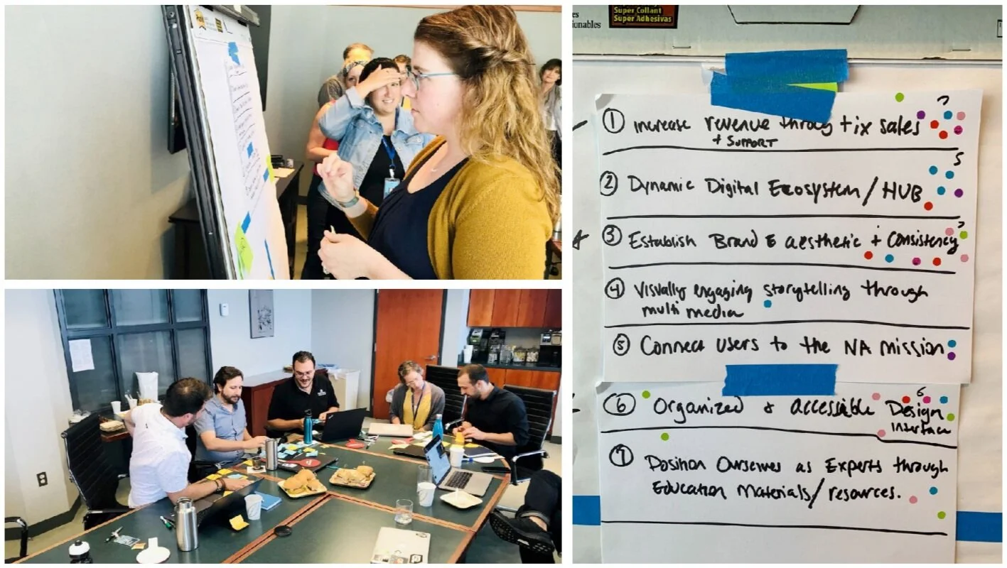
At the onset, we met the National Aquarium team to gain a greater understanding of our goals and objectives. We established a direction and arrived at our primary goals for the new aqua.org through various design thinking activities.
Our Primary Goals
Additional Considerations
Promote visually engaging storytelling through multimedia.
Connect our users to the National Aquarium mission.
Position ourselves as experts through educational materials and resources.
Research & Discovery
We then dug into research to identify opportunities for the new website. What should we prioritize to deliver an organized and accessible site that converts, serves as a dynamic digital ecosystem, and tells a unified brand message for the National Aquarium?
Research Methods -
Brand Audit
Comparative Analysis
Content Audit
Analytics and SEO Audit
Accessibility and Performance Audit
Current Infrastructure and CMS audit
Key Recommendations -
Drastically simplify the site structure to prioritize key user needs and conversions.
Expand the digital brand to align with the excellence of the National Aquarium’s content collateral.
Create a central hub for content to better communicate National Aquarium’s thought-leadership and mission.
Design for accessibility beyond 508 compliance.
Identifying Personas
Using both institutional insights and user patterns via google analytics, we identified primary users for aqua.org and prioritized them.
Personas -
We identified and prioritized personas based on their interests and their likeliness to drive conversion. Those that would come to the website with a transactional mindset were prioritized as primary users. Those that were more information driven became tertiary users.
Primary, secondary, and tertiary personas.
Personas demographics and interests.
Prioritization based on transactional vs. information seeking and price driven vs. mission driven.
Content and Structure
Using Google Analytics, we researched the current state of aqua.org to guide in our decisions around how to prioritize and structure the new site. We found 17,539 URLs viewed in 2019. Of those 17,539 pages, only 900 pages represent 90% of the site traffic.
5% of pages = 90% of all page views
Sitemap
And that leads us to consider our site structure that prioritizes conversion and reduces noise. We then tested our assumptions with potential users.
Information Architecture Card Sort -
We ran an open card sort with 55 participants to further validate our primary navigation.
Key Takeaways:
48% with three groupings
Logical Relationships
Open Sort Groupings:
Visit
Exhibits / Our Animals
Support Us
Design Sprints
Once the sitemap was defined and design direction plotted, we dove straight into four two-week-long design sprints. I served as the lead UX designer on this project, working hand-in-hand with visual design and development.
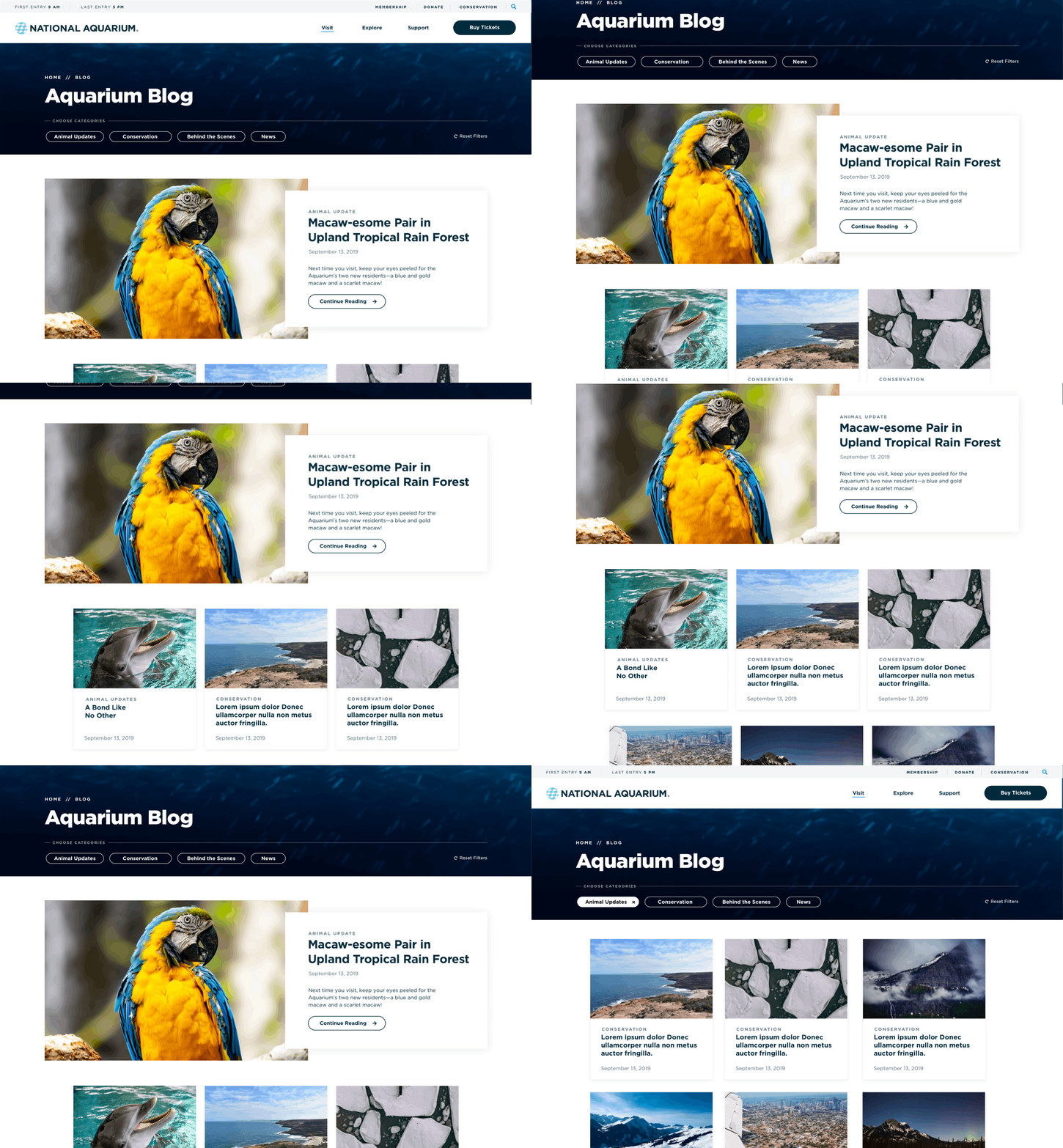
A few of the wireframes:
A List Page
A Detail Page


