The Phillips Collection
UX Design & Animation for a Pitch
Team:
Nicole De Venoge— UX Designer + Animator
Dan Rader— Creative Director
Kendall Jackson — UI Designer
My team at ISL pitched our creative vision for the Phillips Collection’s web re-design. The Phillips Collection is an elegant, modern art gallery in the heart of Washington D.C. It features modern and contemporary pieces in what was once the home of Duncan Phillips. The experience felt at the gallery is bold, inspiring, and intimate.
Our goal: build an experience that is as impressive online as it is in the galleries. And so we asked ourselves what part of the website best captures that experience?
The answer: the exhibit pages and the ticketing flow.
We gave ourselves an assignment: redesign one flow on phillipscollection.org in ~72 hours. Our team wanted to create something that was both inspirational and utilitarian; an efficient and inspiring pathway to conversion.
So what does this flow look like today? Users currently navigate from the homepage to an exhibit page and only from there can they enter the ticket buying flow.
Current site ticketing flow
What opportunities are there for improvement?
Present artwork in a more visually stimulating manner.
Reduce the burden of discovering art & exhibits across the site.
Radically simplify the ticket buying process.
We want to make the ticket buying process as streamlined as possible by:
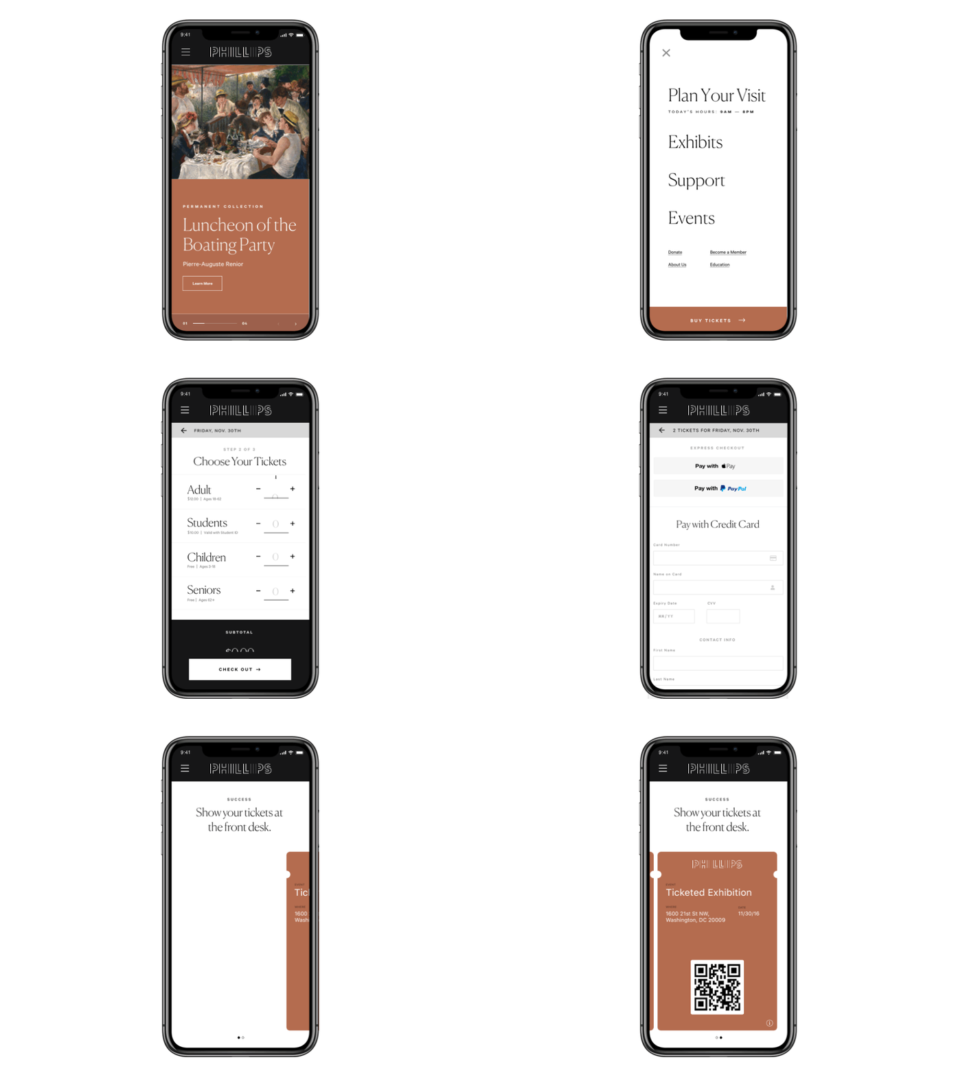
Offering ticket buying from everywhere on the site (open menu).
All we’re asking people to do is select a date, the number of tickets, and give the payment information.
We may even suggest some integrations with modern payment platforms like ApplePay.
(on select a date) notice that we are not mentioning WHICH kind of ticket to buy but instead displaying the same language about the permanent collection here.


